← All work
Harry’s FitcampDesign delivered

Creating classes, scheduling sessions, and assigning coaches.

Restructuring class creation around the way a fitness studio actually works.

Role
UI/UX designer
Type
Client project
Tools
Figma
Timeline
May – Jun 2025
Platform
Web dashboard
Group Class screen
Group Class screen
The brief

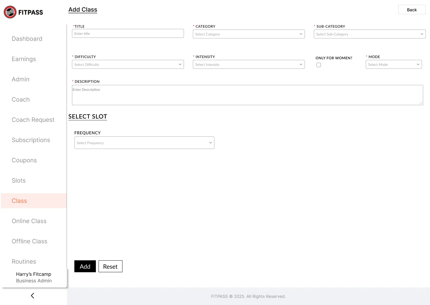
The studio’s existing admin interface used one long form for several class types. Navigation separated online and offline classes, but led to the same fields. Coach assignment was missing from the creation flow.

What I owned

I restructured the navigation, separated Group and Personal Class creation, grouped related inputs, and designed the scheduling and coach-assignment interactions.

Starting point

A client-assigned redesign of the existing admin interface, without a separate competitor-analysis phase.

How I worked

This was a redesign. I went through the existing admin screens against how the studio actually runs its classes, found where the single form broke down, and redesigned class creation around the two class types. I refined it over review rounds before handing it to the developers.

Before → after

Drag to compare.

The client’s original Add Class screen, and the redesign I delivered.

After: redesigned Group Class creation screen
Before: original generic Add Class form
BeforeAfter
BeforeAfter

One generic “Add Class” form for every class type

Separate Group Class and Personal Class flows, each with only its own fields

Online, Offline and Class menus that all led to the same form

Navigation built around the two class types the studio actually runs

Slots hidden behind a single Frequency dropdown

Scheduling sits beside the class details, so the whole class is set up on one screen

No way to assign a coach while creating a class

Coach assignment is part of creation

Design decisions

How it takes shape.

Decision 01 · Separate class-creation screens

Separate class-creation screens

Replaced the single Add Class screen with two dedicated flows under Group Class and Personal Class in the sidebar. Each form shows only the fields relevant to that class type.
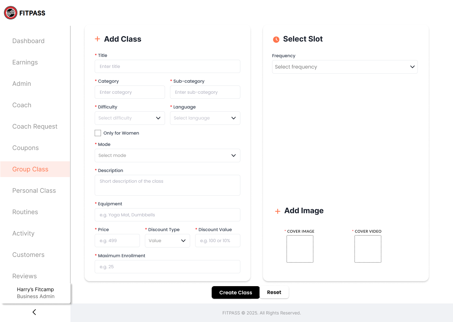
Group Class and Personal Class each get their own entry in the sidebar.

Why it matters

A group class needs capacity, slots and enrolment. A personal class needs one coach and a price. One shared form showed every field to everyone, so admins had to work out which ones to skip. Two forms mean every field on screen is one they need.
Decision 02 · Coach assignment in the form

Coach assignment in the form

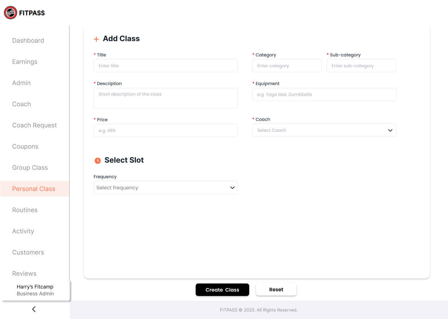
The Personal Class form includes a dedicated 'Select Coach' dropdown - a required field placed alongside Price, not hidden in a separate admin screen or post-creation edit.

Personal Class: Select Coach is a required field, chosen while the class is created.

Why it matters

A personal class cannot run without a coach, so choosing one belongs in creating the class, not in a later edit someone can forget.

Decision 03 · Scheduling beside class details

Scheduling beside class details

The Group Class form uses a split layout: primary fields (title, category, difficulty, pricing, enrollment) in the main column; slot scheduling and cover image/video upload in a right-hand panel that stays visible while filling the form.

Group Class: slots and cover media sit in a panel beside the class details.

Why it matters

Admins think about a class and its timing together. Keeping slots and media in view while they fill in the details saves scrolling back to check what they set.

Decision 04 · Related fields together

Related fields together

Paired fields that belong together sit side by side: Category & Sub-category, Difficulty & Language, Price & Discount Type & Discount Value. Pricing and enrollment get their own row on Group Class.

Price, discount type and discount value share one row; difficulty and language share another.

Why it matters

Fields that are decided together sit together: the price and its discount, the level and its language. The form reads as a few short rows instead of one long column.

Where it landed

Design delivered.

Delivered the redesigned class-creation flows for implementation, with a second version planned by the client.

Reflection

The redesign focused on organising the requested class types and fields. Client approval established the design direction; it did not measure ease of use.

If the work continues, I would check how a studio admin creates a class and refine validation, scheduling, and error states from that feedback.