← All work
Gita QuestInvestor prototype

Exploring the Bhagavad Gita through reading and play.

A gamified mobile learning concept, designed for a client’s investor pitch.

Role
Solo UI/UX designer
Type
Client prototype
Tools
Figma
Timeline
3 days
Platform
Mobile
Start learning
Start learning
See your progress
See your progress
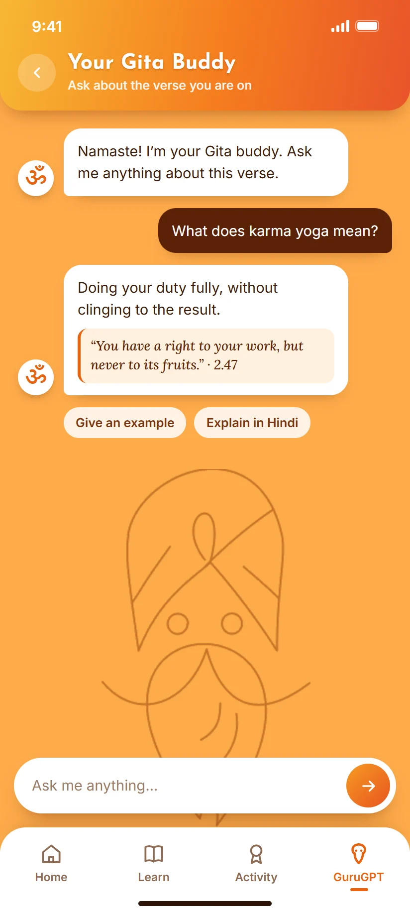
Ask GuruGPT
Ask GuruGPT
The brief

The client’s idea was to introduce young, mobile-native audiences to the Bhagavad Gita through a more interactive format. The challenge was to combine progress and play with a respectful presentation of the text.

What I owned

I translated the client’s requirements into wireframes and interface screens covering learning modes, progression, verse reading, recitation, and the proposed companion.

Starting point

A client-provided idea and requirements, with a three-day delivery window.

How I worked

I had three days before an investor pitch. I went from the brief straight to wireframes, then to final screens, and spent the time on the learning flow the pitch depended on: choosing a mode, moving through chapters, and seeing progress. In 2026 I went back to the same Figma file and fixed what I had rushed: text contrast, button styles, headers and navigation. The illustrations, path and badges are the original design.

Design decisions

How it takes shape.

Decision 01 · Three ways to start learning

Three ways to start learning

The Learn tab opens to three explicit choices: 'Learn Step by Step' (guided, sequential), 'Test My Knowledge' (jump to any chapter and get quizzed), and 'Just Listen' (passive audio, no reading required). Each option is a large gradient card with its own icon and a short line of encouragement - so the mode choice is the first decision, not buried in settings.
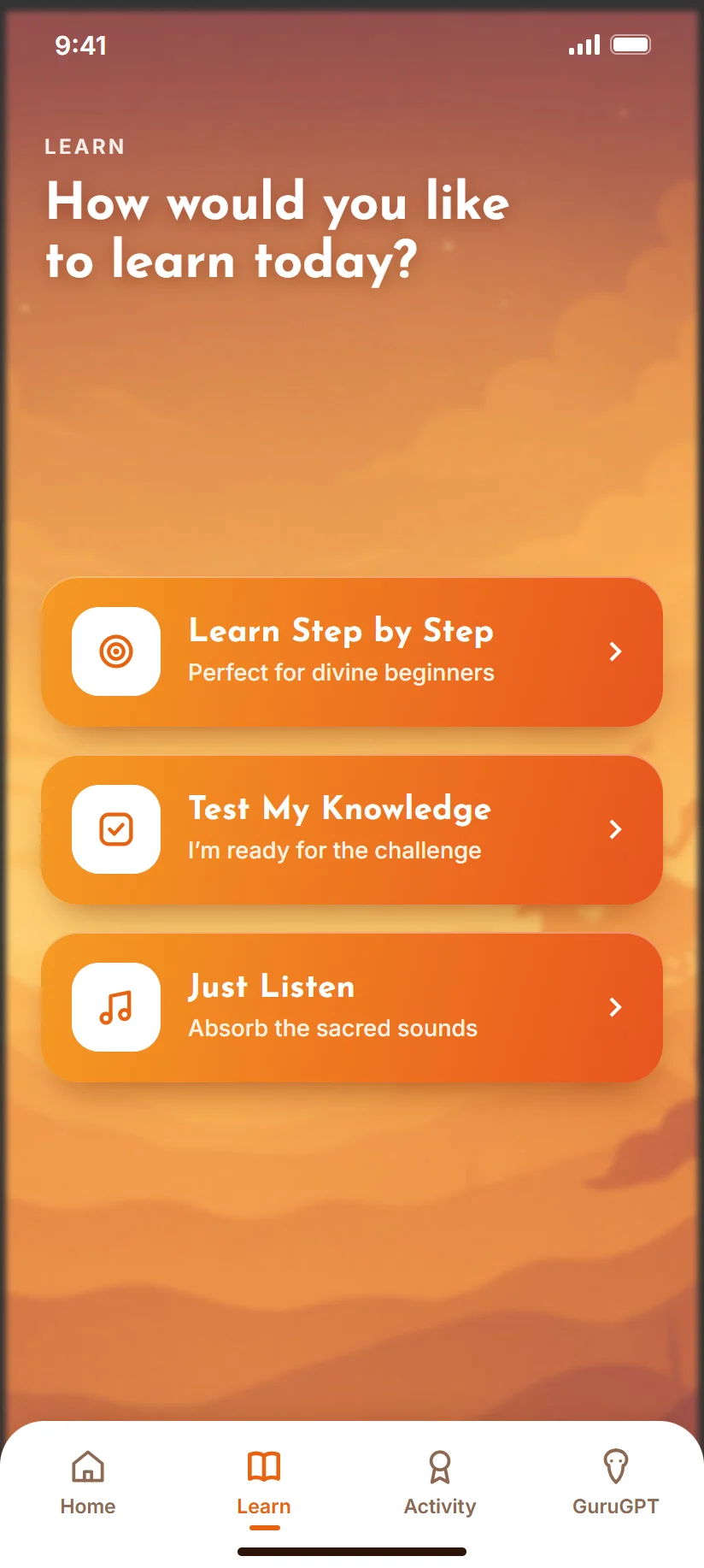
Learn hub: three modes as clear buttons with icons, over the original sunrise art.

Why it matters

People come to the Gita in different ways. Some want structure, some want to test themselves, some just want to listen on a commute. Making that choice the first screen means nobody is pushed into a reading course they did not want.
Decision 02 · Chapter and verse journeys

Chapter and verse journeys

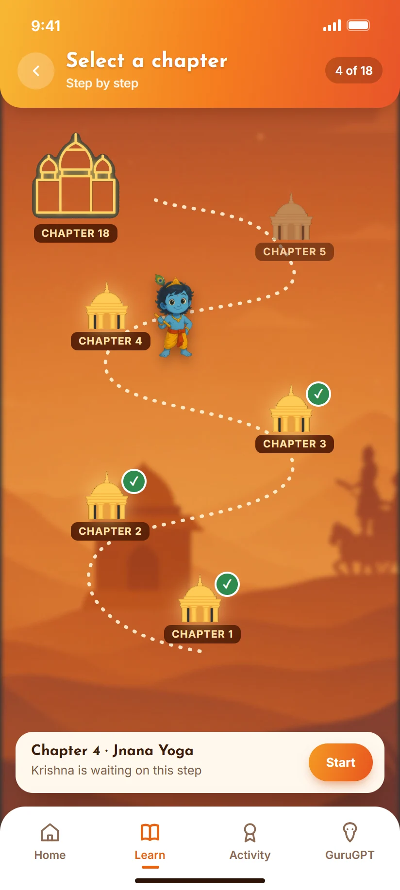
After picking a mode, progress is shown as a snaking map with Krishna standing on the current node. Test My Knowledge uses glowing temple icons for all 18 chapters; Just Listen zooms into a single chapter as a lotus-icon verse path. Same dotted-line journey metaphor, different scale.

Chapter path: done chapters ticked, Krishna on the current one, locked ones dimmed.

Why it matters

Eighteen chapters and 700 verses can feel endless. A path with Krishna standing on your current chapter turns that into a journey with a visible next stop, and the same idea works at chapter and verse level.

Decision 03 · Reading with audio controls

Reading with audio controls

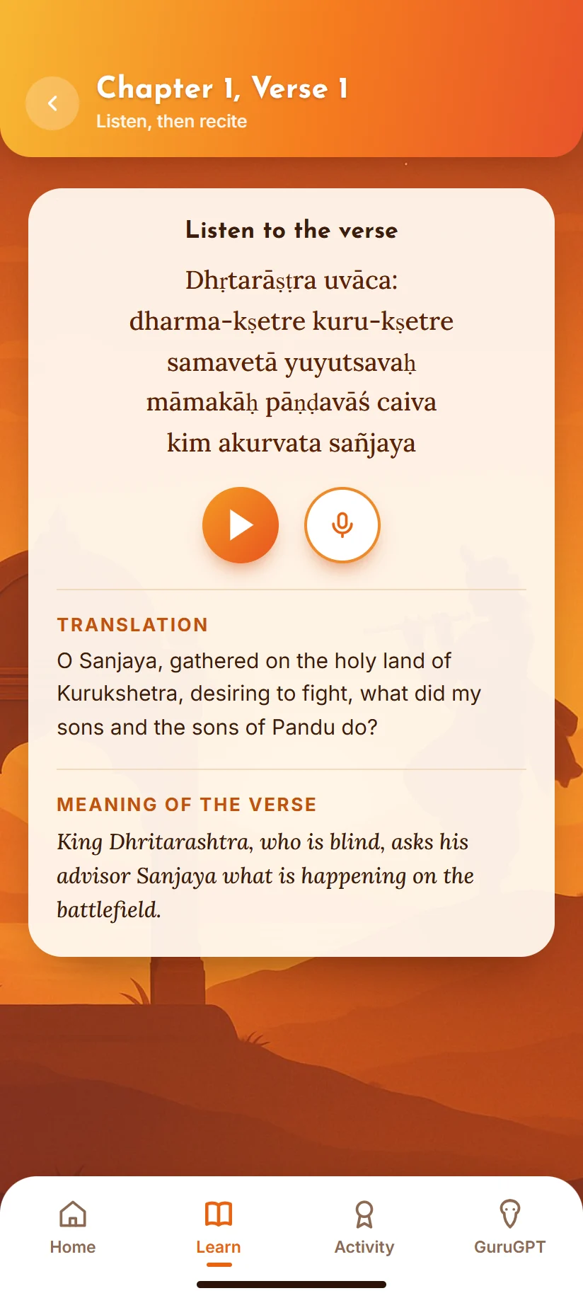
Each chapter is broken into individual verse cards with translation and 'meaning of the verse' sections. In Just Listen mode, tapping a node surfaces a compact player overlay (play button + scrub bar) so users can preview or replay a specific verse without leaving the map.

Verse screen: a solid card for readable text, with filled play and record buttons.

Why it matters

Verses are often learned by hearing them. Keeping the text, translation and player on one card lets listening and reading support each other instead of living on separate screens.

Decision 04 · A visual record of progress

A visual record of progress

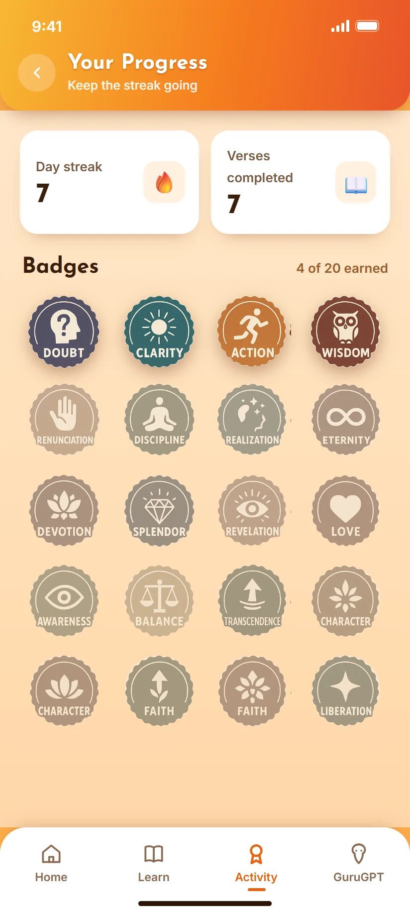
A dedicated Progress screen shows day streak and verses-completed counts up top, with an 18-badge grid below - each badge named after a Gita concept (Doubt, Clarity, Action, Wisdom, Devotion, Liberation, and so on). Earned badges render in full colour; unearned ones sit greyed out in the same grid position.

Progress: earned badges in full colour, the rest greyed out until you reach them.

Why it matters

Each badge is named after an idea from the Gita, so progress also reminds you what you have learned. This was a pitch prototype, so its effect on repeat use has not been tested.

Practise a verse aloud
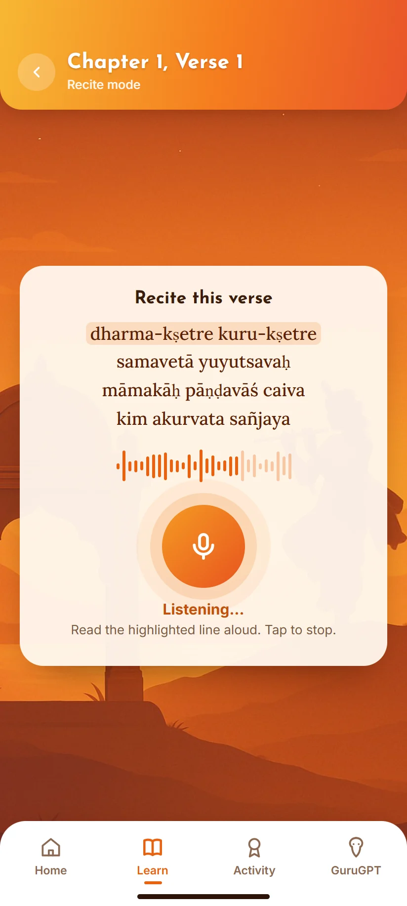
Practise a verse aloudRecite mode highlights the line to read and listens. Pronunciation feedback is a proposed feature.
Set the tone
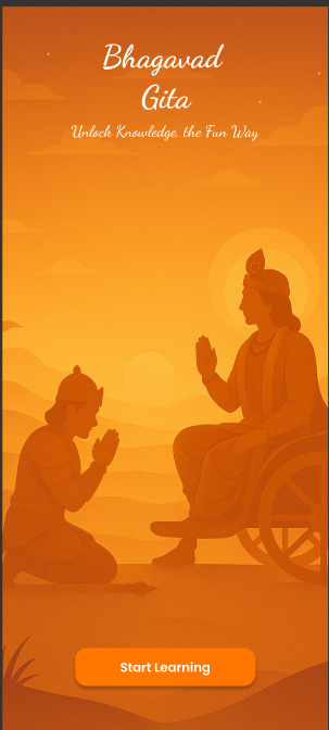
Set the toneThe splash screen carries the warm sunrise palette used across the app.

Where it landed

Investor prototype.

Delivered the prototype in three days for the client’s investor presentation. It demonstrates the intended experience; speech scoring and the AI companion are proposed capabilities, not validated production features.

Reflection

Looking at my second client project a year later, the ideas held up but the details did not: light text on bright orange, outline buttons that were hard to spot, and a tiny Back link. Fixing contrast and buttons without touching the illustrations made the same design read clearly.

The prototype communicates the concept; it does not prove the learning approach works. If it moves into development, I would first test the learning journey with real learners and decide how speech feedback and GuruGPT should behave.